
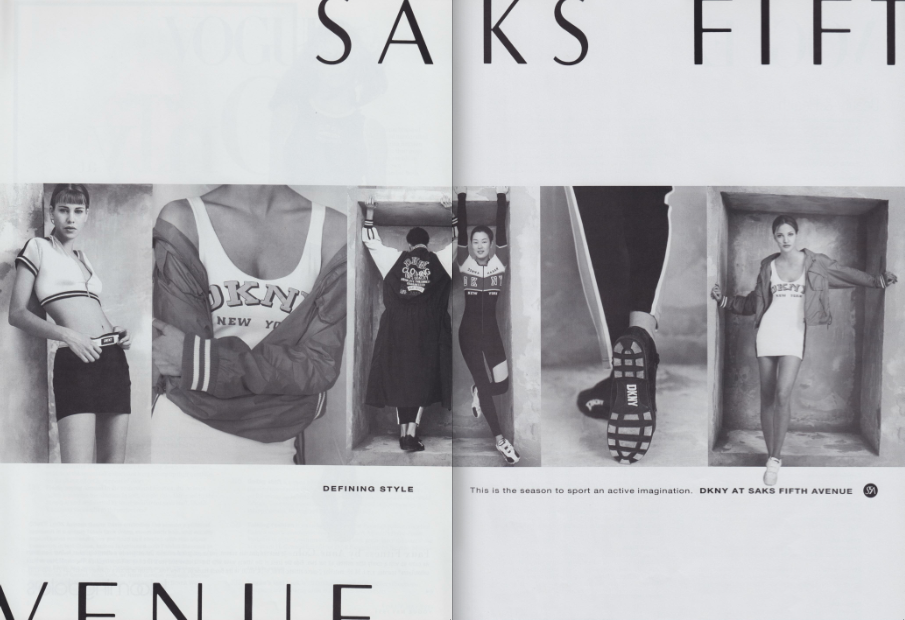
Opening Ceremony's capsule collection collab with DKNY focused mainly on sporty styles emblazoned with the brand's logo. And for good reason--the four letters are completely emblematic and representative of the brand, and its ultimate foray into 90s streetwear culture. OC reissued pieces from 1991-1994, with all looks featuring the oversized logo.
In these ads you can see some of the original looks and inspiration that pretty much defined the era of activewear seeping into modern, everyday dress.


Spring 1994 lensed by Peter Lindbergh (essentially the creator of every DKNY campaign), featuring Peter Fortier, Rosemary McGrotha and 90s superhunk Mark Vanderloo
OC's take on DKNY's activewear and logomania are relevant and thematically important to its image in the 90s. Still, there is much more to the brand and its style sensibility during the decade. Several magazine ads of the era proclaimed: DKNY, "the bare facts of casual," or DKNY, "the basic components of style." Flipping through 90s lookbooks, you see just that. Many of the heavy hitters and stunners don't have a logo in sight. Instead, you see truly casual and covetable basics. These looks below, a sampling from Spring 1994, are a prime example.


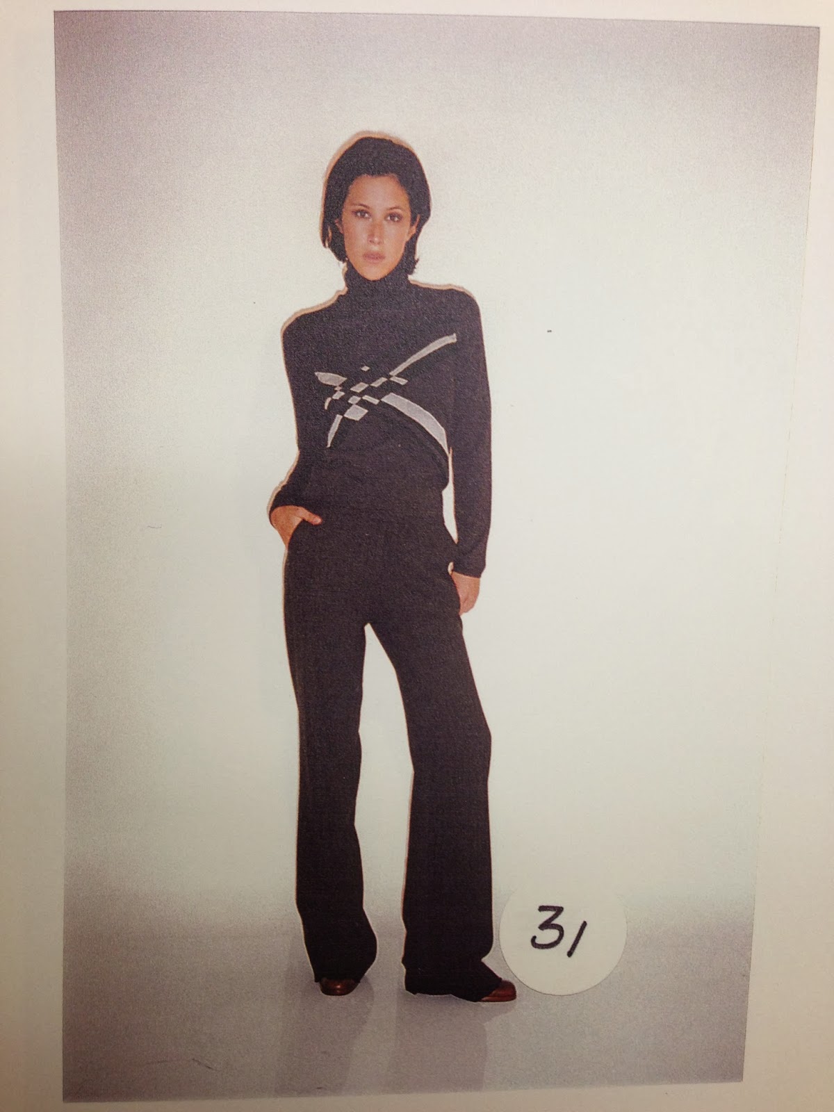


Super pared down, yet kinda inspiring, amiright? Definite reference material almost 20 years later. Below are some notable ads of the decade, shot of course by Lindbergh.


1994: Probably the most memorable DKNY ad of all time. Check out more from the series here. Shot in Times Square, the campaign is chock-full of classic NYC iconography: yellow cabs, traffic lights, and crowds on busy streets. If these ads were re-released today, they'd stand out from the majority of new campaigns, no contest. It's the story-telling art direction, authentic energy, and cinematic quality of the campaign that makes it so timeless. All the photographs were made into a beautifully designed catalog celebrating the city itself. It's wonderful, buy it!
From the beginning, the ultimate
goal of DKNY's branding and advertising was to make consumers associate
the brand with NYC, and the city with the brand. DKNY's Houston St.
Soho billboard (which illustrated the statue of liberty and NYC
cityscape within the letters of its logo) became a kind of landmark of
the city for 16 years, and the former advertising tagline declaring DKNY as "The uniform
of NYC" helped drive the association full force.


Shalom Harlow and Mark Vanderloo getting cozy on set.

I want to be Amber Valletta in this image. Y'know, casually hanging poolside in my palatial backyard, wearing a pristine crepe de chine jumpsuit and drinking fresh-squeezed OJ while reading the latest in Variety. Getting ready to start the day, maybe at 1PM.


Last but not least, here's Spring 1996. Lime green accents and pool slides abound.


1 comment:
what an awesome post! thanks a bunch, always loved dkny aesthetics in the 90's
Post a Comment